Why office design isn’t about mid-century modern couches, unlimited coffee, or pinball machines
Over the past three years, the discussion over remote vs. in-office vs. hybrid work for knowledge workers has been as hotly debated as the never-ending iPhone vs. Android dispute. And just like tech enthusiasts staunchly defending their chosen platforms, in recent months the push from companies like Amazon, Google, and Delta Airlines for their people to stop WFH and RTO has become as insistent as an Android user touting the merits of their open source system.


This blog post will focus on physical workspaces and how they impact our teams and their performance. So, to kick us off I want to pose a question: What can companies learn from the architectural prison design known as the Panopticon?
Wait – prison design? Seriously?
No, we aren’t advocating for approaching companies as prisons. But there is something we can learn from the intentionality behind this particular style of prison design. Please don’t stop reading yet!
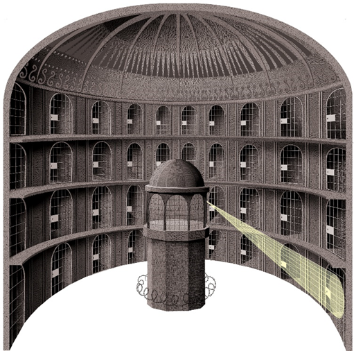
The Panopticon is a prime example of extremely intentional (and ethically problematic) use of physical space to drive human behavior.
Here’s how it works: Cells are arranged in a circle around a central watchtower, allowing a single guard to observe all the inmates. The inmates can’t see into the tower, so they don’t know when and if they are being watched. They just have to assume that the guard is indeed surveilling them and therefore are more likely to be on their best behavior.
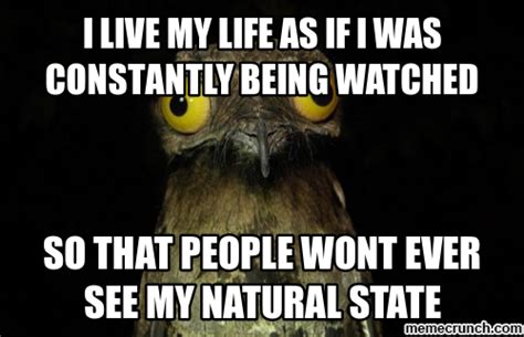
Quick trivia: This design inspired the term “the panopticon effect”. When we believe we are being watched, we modify our behaviors. No one in fact may be watching, but the possibility that someone might be is in itself enough to influence our behaviors. (Don’t get me started on the ethics of this, but you can listen to the podcast episode I linked above.)
The Impact of Workplace Design on Your Strategy
If you’re a frequent reader of our BOxD resources, you’ll know that my team and I help clients align their organization’s design to their strategy and desired business outcomes. But for our new readers (hello there!) let me briefly tell you a bit more about our approach.
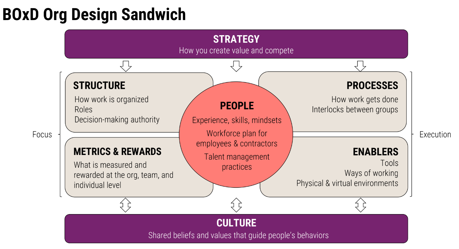
As we think about organizational design, we have to be intentional about all aspects of the business. Effective organizations ensure that every element in the framework below directly supports the execution of the strategy and reinforces the desired culture. Among those elements are physical (and virtual) environments, which when designed well, enable people to do their work by driving specific behaviors.
The Powers of a Well Designed Space
The influence our physical spaces have over our experiences can be distilled into two categories: physical power and psychological power. Let’s talk about some of the key aspects that define each category and explore how they shape our day-to-day interactions and productivity.
Physical Power
- Enhancing efficiency and functionality – The placement of departments or teams, the distance between key resources, or the accessibility of tools and equipment can either streamline workflows or hinder them.At the risk of dating myself, if you’ve ever been in a Home Economics class, you’re likely familiar with the concept of the golden working triangle, which provides guidelines for the optimal placement for the refrigerator, sink, and stove. In a good kitchen, the spaces are neither too far apart, nor too close to each other; there is enough distance between them to create clearly delineated traffic lines. The same should be true in our workspaces.
- Directing the flow of movement and interaction – Space can dictate how we move, guiding us through environments in subtle and not-so-subtle ways.An open plan layout encourages collaboration, while designated cubicles create a more solitary experience. Or, imagine a hospital where the elevators are available but placed in less visually prominent locations on each floor, and the staircases are wide, airy, and with a lot of natural light. This encourages medical staff to take the stairs, increasing the likelihood that they will bump into each other and exchange notes on their shared patients, ultimately improving the level of care their patients receive.
- Ensuring inclusivity and accessibility – It’s critical that workspaces are designed for everyone to be able to do their jobs well. This means considering factors like wheelchair access, adjustable desks for varying heights, and spaces that cater to different work styles. Providing quiet rooms for focused work or rest, alongside communal areas, supports a diverse range of needs.
Psychological Power
- Affecting the state of mind – It’s not just about how a space looks, but how it makes us feel. Colors, textures, and smells can all evoke emotional responses. One Medical, a primary practice that aims to redefine the doctor’s visit (more details on their approach below!), has designed its lobbies to look more residential or like that of a cozy hotel to lower patients’ anxiety. The joining or separation of spaces can also tell our brains that it’s time to shift modes. Think cozy corners for quiet contemplation versus large open areas for group brainstorming.
- Nudging individual behaviors – Subtle cues in our environment can influence our actions, a concept known as ‘nudge theory’. Maybe it’s a whiteboard inviting impromptu brainstorming, or a centrally placed recycling bin. These ‘nudges’ can guide behavior in a non-intrusive way, aligning individual actions with organizational values.
Let’s talk a bit more about One Medical, as they are a great example of design that expertly uses both physical features and psychological cues.
Micro Case Study: One Medical
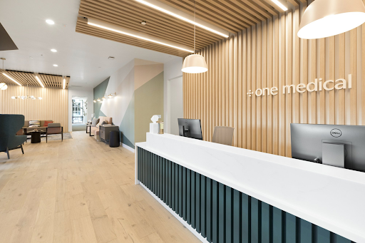
If you’ve not heard of One Medical before, they are a membership-based healthcare provider with a unique and intentional approach to workspace design. Their mission is to “help transform health care, and to delight people with better health, better care, and better value, in a better team care environment.” Using this mission as their guiding light, they are able to provide a frictionless primary care experience to their patients with their strategically integrated technology and in-office design approach. They released a short 1 minute YouTube clip explaining the intention behind their spaces, and I think it’s a prime example of designing for your business model, strategy, and culture.
Designing the Right Spaces for Your Organization
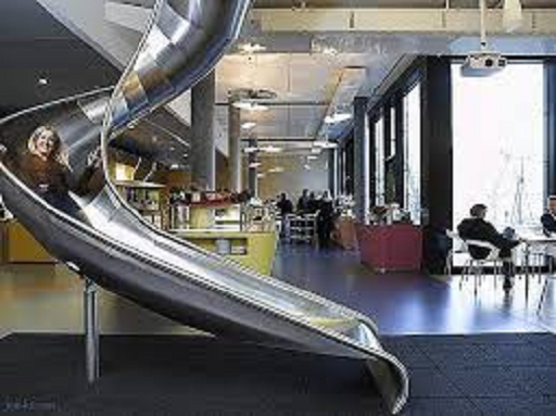
While the allure of trendy, Pinterest-worthy offices is strong, if you’ve read this far, you know that workspace design is not just an aesthetic exercise. Yes, a playful or avant-garde office may spark interest, but the value lies in how well the space supports your organization’s current needs and future aspirations. A well-thought-out, practical design trumps a beautiful yet functionally deficient one every time.
So how do we evaluate what kind of spaces might be most effective for our teams? Here are a few questions for you to consider:
- What are the business outcomes you want to achieve? – Going back to the Panopticon, one of the designer’s goals was to drive cost savings and reduce the amount of staff required. The design scaled down from several guards to one or two per shift. For your business, it may be about greater innovation or customer focus.
- What behaviors and mindsets will support that outcome? – This can apply to both your people or visitors (such as customers or new recruits).For example, a client’s goal was to improve their end customer’s experience. To do this, they realized they needed to improve the collaboration across the product management, development, and customer support teams.Each of those teams reported into separate leaders – and their seating arrangements reflected that! The development team was on one floor, the product management team on another, and customer support in a whole other building.
By placing them in desk clusters of product management + development + customer support, the teams were better able to exchange information real time and incorporate that into their responses to customers and into future product iterations. - Whose perspectives do you need to center and include to create a space that will work for everyone who will interact with it? – For example, the Lucile Packard Children’s Hospital Stanford is designed not just for the medical staff, but their little patients themselves.Care-team work stations within each have clear portholes built into the stations’ desks. They’re positioned at the height of a child’s eyes and contain life-size images of animals and plants.
BOxD would love to work with you to examine how your physical workspaces impact team performance. Let us help you innovate to make work more effective, enjoyable, and inclusive!
 Ready to Talk Now?